
The New Face of Rochester
The University launches a new graphic identity program.
By Kathleen McGarvey
Imagine how difficult it would be to conduct business if your name looked different every time you signed it.
Consistency is just as important for universities. That’s why Rochester began in 2006 to develop a new graphic identity, one that involves not just a redesigned logo but an overhaul of when and how its “signature” is used.
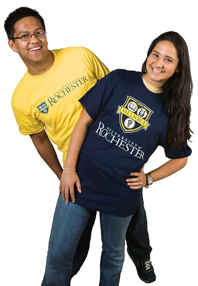
NAMEPLATE: The new logo will become Rochester’s new “signature,” providing a consistent identification system for the University. It will be used on clothes—modeled by Alvin Lomibao ’09 and Janna Gewirtz ’09—and on glassware, accessories, and other items.
One year and countless hours of design time later, the unveiling is here. This fall marks the launch of the University’s new logo.
It’s fresh, but still familiar. Clear-cut, but flexible. Unique, but resonant with history. University designers, with the input of alumni, students, faculty, and staff, have worked hard to achieve those delicate balances. Now it’s time to put the logo to use.
From sweatshirts and notebooks to stationery and signs, brochures and banners to Web sites and coffee mugs—everywhere, in short, that the University of Rochester name appears—the new logo will be there. A new “spirit mark” has also been developed for athletics (see sidebar).
A good logo “strengthens the identity of a university,” says George VanderZwaag, athletics director. After all, for most people—prospective students and their parents, alumni, potential faculty, community members, news agencies, government officials, and others—encounters with the University are intermittent. What ties their varied glimpses of Rochester together?
“A strong graphic identity can do that,” says Bill Murphy, vice president for communications. “It creates a reinforced impression.”
It was the lack of such reinforcement that spurred the effort to develop a new logo. When the Board of Trustees outlined priorities for Rochester’s 10th president, it emphasized raising the University’s national profile. Soon after his arrival, President Joel Seligman tapped public relations expert Fred Volkmann, vice chancellor for public affairs at Washington University, to review Rochester’s communications practices.
Volkmann quickly saw for himself the need for a better identity system. As he met with people throughout the University, he amassed a wide collection of business cards. They were virtually all different in design, and he was amazed “by the chaotic variety of what he encountered,” Murphy says.
The cards were just a symptom of a larger difficulty: Over time, schools and offices throughout the University had developed their own distinctive logos. The dearth of commonality obscured the fact that the University of Rochester is home to them all.
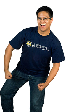
IDENTITY: The new logo’s tri-circle shield is based on the shield that appears in the University’s seal. The new identity program also emphasizes Rochester’s school colors of blue and “dandelion yellow.”
“We needed somebody to come in and gradually put the solid stamp on one set of things,” says Jonathan Burdick, dean of admissions and financial aid. “For us in admissions at the College, it’s a no-brainer” to assert a unified identity.
“The College at the University of Rochester isn’t what we’re marketing. Students are applying to the University of Rochester,” he adds.
“I don’t know that there was anything wrong with the previous logo, but it was just not being used,” Murphy says.
“Departments were creating their own logos, and the old logo wasn’t as flexible as it might have been.” In fact, the inflexibility of the previous logo was probably what drove people to develop ones that better suited their needs, he surmises.
It’s not an unusual problem. Organizations of all kinds must pause to retool their graphic identities when the symbols they have no longer work. Boston University is just one institution of higher education currently in the midst of a “rebranding” process.
Give Me an ‘R’!
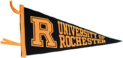
If you went to a Rochester football game last season, you might have noticed that the team was playing in plain blue helmets. Think of them as a blank slate.
“We took the ‘UR’ off the football helmets last season, in preparation for the arrival of the new spirit mark,” says Athletics Director George VanderZwaag.
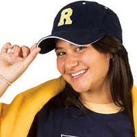
When the team suits up this season, they’ll be wearing that mark—a block “R” that will appear on sports uniforms, athletics publications, and the athletics Web site, as well as on items produced by the Student Activities Office and on apparel and novelty items available at the University bookstore.
The spirit mark is one facet of Rochester’s new graphic identity. VanderZwaag was part of the group that helped design the University’s main logo, and he says the development of the block “R” was a natural extension of that work.
“We waited until almost the very end” of the process for building a new graphic identity to address the spirit mark, he recalls. “The key here was not to compete with the overall graphic identity while developing something appropriate for the athletic domain.”
When he came to Rochester in 1999, VanderZwaag says, he immediately wondered what Rochester’s spirit mark was. He saw a confusing jumble of University athletics logos on uniforms, publications, and facilities.
“We’ve been struggling with this for a while. If every time a team takes the field, you don’t readily recognize it as the University of Rochester, you lose the message.”
Designers picked up on a block “R” that had already been in some use, refined it, and codified the design so that it will be easily identifiable.
“We weren’t creating something really new—we were agreeing on what it would look like,” VanderZwaag says. “We had historical precedent and a strong overall graphic identity that was agreed upon, so when it came time to develop the spirit mark, the process wasn’t difficult at all.”
—Kathleen McGarvey
“Repetition is a very big part of what makes a brand successful, and if we talk about the university differently every time,” the power of the brand is lost, says Boston University’s assistant vice president for strategic communications Joel Seligman (no relation to Rochester’s president). “We’re looking for a rational, harmonized communications process.”
A carefully considered marketing plan is essential to wise spending on communications, Boston’s Seligman continues. “We think it’s a more responsible approach to say we’re doing this intelligently. . . . You don’t let departments just use their own accounting systems. It’s the same for communications. We can all do it differently, but it’s not as effective as if we’re doing it all together.”
In that spirit, Murphy convened communicators from around the University to begin work on a new graphic identity soon after he was hired in 2006. One of the first steps was to identify ideas they wanted the logo to convey. Suggestions included research, leadership, freedom, passion, and intellectual strength.
Narrowing the list was a necessary challenge.
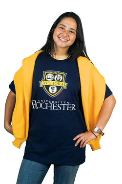
SOUVENIR SPIRIT: The new logo and identity system includes a block “R” that will be used by athletics and student life organizations. The shield will be used to represent the University.
“A successful logo graphically symbolizes a product or institution and evokes its strengths without describing it in detail,” says Steve Reynolds, director of publications in the University Communications Office.
As the group refined the list of key concepts and examined other universities’ logos, it also met with Nancy Martin, the John M. and Barbara Keil University Archivist, to learn about themes and images recurrent in Rochester history. She told them about the story of the dandelion, the history of the school colors (which were first magenta and white, then light blue and gray, and finally the familiar yellow and blue), and the development of the official University seal, which first appeared in 1851, was redesigned in 1928, and was last revised in 1985.
“The seal was seen as the logo in the early 20th century,” Martin says, and continued to appear in places where the logo would be expected, such as on stationery, brochures, signs, and memorabilia. Nevertheless, the seal is meant only to be used in official capacities, such as on diplomas.
As the process for the redesign took shape, there was also the question of how the project should be carried out. One option was to hire a consulting firm. That’s what Rutgers University did—at a hefty price tag. Rutgers paid its consulting firm $570,000 to develop a new message, create a new logo system, and retool its advertising, according to New Jersey’s Star-Ledger.
In contrast, Murphy elected to create Rochester’s new logo using the talents of designers already employed by the University.
“Because we used in-house designers, we’ve really been able to minimize the out-of-pocket cost. And we’ve tried to do it in a way that’s not wasteful, by working with the bookstore to plan inventory, and encouraging offices not to toss out old stationery,” he says.
When University designers went to work, they focused not only on Rochester’s distinctive images but on the qualities of effective graphic identities. Consistency and simplicity are essential to a good logo. Think of the ubiquitous Nike “swoosh” or McDonald’s arches. While the ideas underpinning a university logo are more complex, the end result should be just as emphatic.
“All a logo needs to do is remind you of the thing it’s representing,” says graphics coordinator Michael Osadciw. “And the heavy lifting of that has to come in consistency and repetition. It can’t all be bound up in the graphics.”
Designers sketched possible logos suggested by the key words that people had identified, trying out different graphics and typefaces. Ideas changed along the way.
“People said they really wanted something distinctive, which the designers took to mean bold and daring,” Murphy says. “But when they saw those designs, it was clear from people’s reactions that they wanted something strongly traditional, something that said we belong in the top tier of American research institutions.”
The feedback generated more ideas, and, as Murphy had hoped, designers multiplied the options rather than whittling choices down. At one stage, they filled an entire wall at Wilson Commons with logos and listened as people inspected them. Most viewers responded favorably to the notion of using a coat of arms.
“Logos with type only were thrown out very early. People wanted a graphic,” Osadciw says. “The present logo, with just type, didn’t fit people’s idea of what a logo should be.”
Developing the new look was complicated because designers had to invent a logo that not only captured the spirit of the University but also met the needs of its many component parts.
While a logo depicting the dome of Rush Rhees Library or a dandelion might work for the College, for example, it would not be as meaningful for the Medical Center, or the Memorial Art Gallery, or the Eastman School. Designing the new graphic identity was a process of compromise, adjustment, and constant discussion.
By early fall 2006, the generative phase was at an end, and Murphy presented the top 14 alternatives to the Faculty Senate, the president’s cabinet, the University management team, and students, who participated in special “town meetings” to give their views.
“How the University is represented is important to students, and their turn-out showed that,” says Associate Dean of Students Anne-Marie Algier.
“I definitely think the logo is important” to recognition, says Alvin Lomibao ’09, incoming president of the Students’ Association and a participant in the town meetings. “Students were all really open to seeing this change.”
To her surprise, Algier says, students preferred a logo denoting a “dignified, serious research university. They didn’t want it to be contemporary. They were more conservative than I thought.”
They weren’t alone. As the review process unfolded, more traditional logos were clear favorites over more unusual, contemporary looks. The designers took the feedback and came up with an entirely new set of choices, and again asked faculty, students, and staff for comments.
The choices narrowed to eight, then to five. The University posted these final designs on the Web and invited feedback. More than 10,000 alumni, faculty, staff, and students responded, indicating their pick and the reasons for their choice.
As votes go, it wasn’t exactly a nail-biter. More than 50 percent of the people in every constituent group chose the same design as their favorite. Armed with respondents’ opinions, designers made some final tweaks. And a new logo was born.
“One of the strengths of the logo is that while it’s a new graphic presentation, it is also very traditional and grows out of our history. It’s an adaptation of the coat of arms in the seal,” Murphy says.
Archivist Martin agrees. “I think the logo is quite new in terms of what it does,” she says. “It has many familiar elements, but I don’t think it’s ever been quite as distilled as an arrangement.”
“One thing about the coat of arms that is unusual is that the three symbols are in circles on the shield. That’s distinctive to the University of Rochester, and people really wanted to retain that” and to include the founding date, Murphy says. “And the word on the banner in the new logo is Meliora. I think it’s one of the strongest mottos a university could hope for.”
“Coming up with it is the easy part,” he continues—a daunting thought, given the year of effort that went into developing it. But as Osadciw observes, no matter how ingenious the design, a logo is meaningless if it is not used consistently.
In creating the new University signature, designers considered carefully the venues in which it would appear to ensure the adaptability necessary for success.
“There are very different design considerations for a sweatshirt and stationery,” Murphy explains. The logo must work just as effectively when blown up to cover a banner or shrunk to fit on a business card. It must work vertically and horizontally, on dark backgrounds and light, in color and black and white.
In evaluating those variables, designers and administrators also revisited the University colors. While the famed dandelion yellow remains as is, the blue has become slightly darker. “It’s a more dignified blue,” Murphy says. “And for spirited uses, it provides a better contrast with yellow, so you get a livelier presentation.”
Creating a flexible set of graphic standards that would allow schools to combine their names with the new logo in a consistent way took most of the summer. At the end of it all, though, Rochester’s new graphic identity system makes it plain that Rochester is, in President Seligman’s words, “one university.”
“What’s valuable to me is the way the process has carried out now, for a year plus,” says Burdick. “All the component parts of the University are seeing the benefits.”
When Burdick arrived at Rochester four years ago, the Office of Admissions for the College itself used two different logos—and he found that students considering their college choices often weren’t aware that the Eastman School, for example, was part of the University. That ambiguity only blunted Rochester’s efforts to attract the best students, he says. He is pleased by the advent of a system that will help prospective students and their parents easily identify Rochester materials—and discover, without additional searching, all of the resources and opportunities that await them.
“For us, it’s extra fuel in the car,” he says. “I think we’re going to be very happy we did this two years from now, and even more 10 years from now, when we’re really seeing the effect.”
Kathleen McGarvey is a writer in the University Communications Office.
