
Best Practice Article Series
What you need to know about the web style guide
Many writing professionals appreciate when an organization has a dedicated style guide, or a set of standards for written communication. A style guide can be particularly handy when it comes to creating consistency across digital communications, which often span a variety of formats and platforms—from web pages to e-newsletters, social media posts to PowerPoint presentations.
Knowing about and adhering to your organization’s style guide can make your work as a web content creator or manager easier. But it can also improve the user experience for your specific website visitors while creating cohesion between the different areas of the University of Rochester’s expansive digital presence.
What is a style guide?
A style guide is a reference for writers, editors, and other content creators that answers or addresses questions about style, usage, grammar, and formatting.
You may be familiar with using or referencing style guides from your academic work or professional experience. Common examples include:
- Chicago Manual of Style
- Associated Press Style
- American Psychological Association
- Modern Language Association
At the University of Rochester, we have an editorial style guide that is maintained by University Communications. This guide is primarily based on the Chicago Manual of Style and Merriam-Webster’s dictionary.
PRO-TIP: You can access the Chicago Manual online and for free when connecting through the University’s internet network or the library system.
Several years ago, we on the web communications team created a web-specific style guide for content creators and managers in the School of Arts and Sciences and the Hajim School of Engineering and Applied Sciences. Our guide works in tandem with the University Communications document but focuses on web best practices and the digital experience.
Why follow the style guide?
The short answer is consistency. Consistency—in spelling, punctuation, formatting, and our communications generally—throughout our websites conveys professionalism. It also improves the readability, usability, and accessibility of our web content.
Style guide entries worth noting
We recognize that most people aren’t going to sit down and read the web style guide from cover to cover, so to speak. For that reason, we’ve compiled a list of the most common style guide-related issues that come up while we’re creating and editing content for our websites.
Avoid abbreviating University of Rochester
We understand that “UR,” “U of R,” and other abbreviations are common, even beloved. And for strictly internal or informal purposes, there is flexibility on this point.
Yet on the University’s website and social media accounts with any kind of external audience, spelling out “University of Rochester,” especially on first reference, is crucial. The reason is two-fold: branding and search engine optimization (SEO). To someone outside of the immediate Rochester region or community (or to the robots at Google), “UR” or “U of R” could potentially refer to the University of Richmond, University of Redlands, University of Regina, University of Reading, University of Minnesota–Rochester, etc.
On second reference or if the reference is clear, the use of “Rochester” is acceptable to refer to the University of Rochester.
Compare: "He works at Rochester" to "She lives in Rochester."
Or see this headline: “Low inflation rates hurt the Fed’s credibility, says Rochester economist”
Finally, in a deviation from the Chicago Manual, we capitalize “University” when referring to the University of Rochester.
Use only one space after punctuation
There was a time when two spaces after punctuation was the norm. Fortunately, the age of manual typewriters and monospaced fonts has passed.
Today, every modern web publishing platform—including the web content management system we have—uses proportional fonts. This means that the amount of space between letters and punctuation is automatically adjusted to be correct. The result? No gaping holes or rivers of white space.
Adding extra spaces after punctuation is particularly vexing on social media. Twitter, for example, only gives you 280 characters (including spaces) per tweet. Why waste one of those precious characters on an unnecessary space?
Embrace “down style”
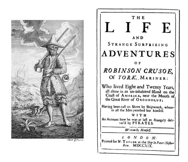
Excessive capitalization can be distracting and difficult to read. (Don’t believe us? Try reading the title page of 18th-century novel.)
Chicago Manual’s preference is for the “sparing use of capitals,” also known as “down style.” So, except when used as part of a formal proper name, we typically lowercase:
- Common nouns
- Job titles (e.g., professor, dean, president—unless the title directly precedes a name)
- Academic degrees (e.g., bachelor’s degree, master of science)
- Subjects (e.g., materials science, public health—but we capitalize any proper nouns such as English and Latin)
- Headlines (but titles of works are still usually capitalized and italicized)
- Seasons (e.g., fall, spring)
A notable exception to this lowercasing tendency is with regard to hashtags. For accessibility purposes, “camel case,” or capitalizing the first letter of a new word, is the preferred formatting for hashtags. If a visually impaired person uses a screen reader to access the content, the device will read the words individually rather than as one long incoherent word. Capitalizing each word in the hashtag makes it easier for sighted readers to quickly understand the hashtag, too.
Compare: #WomensHistoryMonth versus #womenshistorymonth, or #FridayReads versus #fridayreads
Your turn
We believe web style guides will never go out of style. However, all style guides are living documents that need to change and update to reflect the latest trends, best practices, and research in web writing and digital communications.
What are your editorial style questions or concerns? Want us to review your site or other web content for style? Or perhaps there’s an entry you’d like to see added to the web style guide? Send us a note.